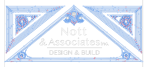
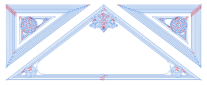
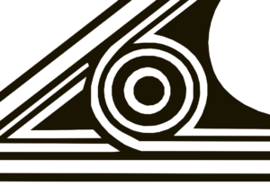
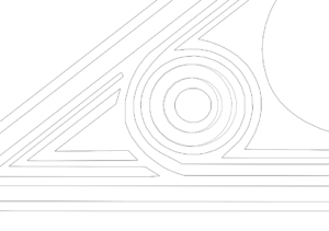
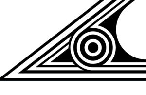
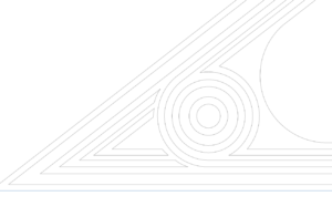
The logo of Nott & Associates, originally drawn by an architect Tom Nott, had significantly degraded due to multiple attempts of vectorization resulting in jagged lines, circles had become ovals, and an extreme over use of vector nodes.
Introduction:
In the dynamic world of design, a logo serves as the visual anchor for a brand’s identity. Tom Nott’s original logo illustration, a timeless piece, had unfortunately fallen victim to the distortions caused by years of improper vectorizing tools. In this blog post, we’ll explore the meticulous process of breathing new life into the Nott & Associates logo, unveiling three distinct variations – Minimum, Median, and Maximum.
The Challenge:
The client’s request for logo variations that could seamlessly scale for letterhead and embroidery on company polo shirts presented a unique challenge. The task at hand involved not just a mere facelift but a complete restoration of the logo’s original integrity. The primary focus was on rectifying the distortions caused by previous vectorizing attempts.
The Redrawing Process:
The first step in this logo redesign journey was retracing Tom Nott’s original illustration. The deterioration caused by vectorizing tools had left circles stretched into blocky ovals, and straight lines became jagged and crooked. The mission was clear – circles needed to be round, lines had to be straight, and the vector nodes had to be significantly reduced to only the necessary amount.
Variations Unveiled:
1. Minimum:
The Minimum variation, with 4 lines instead of the original 6, was inspired by the website logo. This version served as the benchmark for scalability, ensuring the logo’s adaptability for different applications, from digital letterheads to embroidered polo shirts.
2. Median:
As a middle ground between the Minimum and Maximum, the Median variation retained 5 lines. This version struck a balance, capturing the essence of the original while incorporating subtle modifications for enhanced visual appeal.
3. Maximum:
The original logo, now rejuvenated, maintained its essence with 6 lines. This version, labeled as Maximum, pays homage to Tom Nott’s initial design while ensuring a crisp and polished finish.
Visual Transformation:
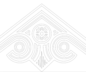
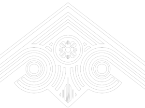
Below, we present zoomed-in before and after images, showcasing wireframes and filled graphics. The stark contrast between the original deterioration and the revitalized design highlights the magnitude of the transformation. Circles are now perfectly round, lines are straight, and vector nodes have been meticulously optimized.
Conclusion:
In the realm of logo design, preserving the authenticity of the original while adapting to modern needs is a delicate art. The Nott & Associates logo redesign journey stands as a testament to the dedication and skill required to breathe new life into a timeless symbol. Through thoughtful adjustments and a keen eye for detail, the logo now stands ready to represent the brand with renewed vigor and clarity.
